Dark Patterns in UI UX Design
- Shubham Pandey
- Mar 21
- 9 min read


Dark patterns in UI UX design are interface tricks that push people into actions they did not intend to take. A button may look harmless, a checkbox may be quietly selected, or an offer may appear cheaper than it really is until the final step. These patterns are not just annoying. They can damage trust, increase refunds, create legal risk, and make users feel manipulated.
In this blog on dark patterns in UI UX design, we will look at the most common patterns in detail, understand how they work, and see real world style examples that make each one easy to recognize. The goal is not only to identify bad design, but also to understand how ethical design can do better.
Why dark patterns in UI UX design matter
Dark patterns in UI UX design often work because they exploit attention, urgency, confusion, or habits. A person may move quickly through checkout, skip reading small text, or trust the default option because the interface feels familiar. That is exactly why these patterns are powerful. They do not force users directly. They nudge them in a misleading way.
For businesses, this can increase short term conversions. But in the long run, dark patterns in UI UX design usually create the opposite of what a good product needs. People lose trust, support tickets rise, app store reviews drop, and users remember the brand as manipulative rather than helpful.
1. Roach Motel

Roach Motel is one of the most common dark patterns in UI UX design. It is very easy for a user to get into a service, but much harder to get out. Signing up is smooth, subscribing is effortless, and activating a trial takes only one tap. Cancelling, however, becomes a maze of hidden steps, delays, and extra confirmations.
A classic example is a music app that allows instant signup with one click, but when the user wants to cancel, it redirects them through multiple screens, asks for feedback, shows a discount offer, and then makes them search for the final cancel button.
This pattern feels frustrating because it turns a simple action into a burden. Ethical alternatives are clear account settings, a visible cancel button, and a straightforward exit flow.
2. Hidden Charges

Hidden charges are a very deceptive form of dark patterns in UI UX design. The product looks affordable at first, but the real cost appears only after the user has invested time or reached the final checkout screen. Extra fees may include service charges, convenience fees, delivery fees, taxes, booking fees, or mandatory add ons.
For example, a travel booking website may show a room at a low price, but once the user reaches the payment page, the total jumps sharply because of resort fees and service fees that were not clearly disclosed earlier. The user feels tricked because the initial price set a false expectation.
Good design makes the full cost transparent from the beginning. If there are extra fees, they should be visible early and explained in plain language.
3. Bait and Switch

Bait and Switch happens when an interface promises one thing and delivers another. In dark patterns in UI UX design, this is often used to get the user to click something attractive, only to replace it with a different action.
A simple example is a software download button that looks like a free file download, but after clicking it, the user is sent to an unrelated app install page or an upsell screen. Another example is a “continue” button that leads to a subscription page instead of the expected next step.
This pattern breaks trust fast because the interface behaves like a trap. A clear label, honest button text, and matching outcomes are the best defense.
4. Confirm Shaming

Confirm shaming is a dark pattern in UI UX design where the user is made to feel guilty, careless, or foolish for refusing an offer. Instead of a neutral opt out, the decline option is written in a manipulative way.
For example, a newsletter popup may show two buttons. One says “Yes, send me helpful updates.” The other says “No, I do not care about saving money.” The second button does more than offer a choice. It insults the user’s decision and pushes them toward the desired action.
This kind of language is emotionally manipulative. Respectful design should make both choices equally clear and emotionally neutral.
5. Disguised Ads

Disguised ads are a subtle but serious type of dark patterns in UI UX design. These ads are designed to look like organic content, navigation items, recommendations, or system notifications, so users click them without realizing they are sponsored.
For example, a search page may place a sponsored result at the top and make it look almost identical to the real results. Or a news app may show an ad card that visually matches editorial content, with only a tiny label telling users it is sponsored.
The problem is not advertising itself. The problem is deception. Ads should be clearly labeled and visually distinct so users can make informed choices.
6. Forced Continuity

Forced continuity is a very common subscription trick in dark patterns in UI UX design. It usually appears when a free trial ends and the user is automatically charged without a clear reminder or easy cancellation flow.
A user signs up for a seven day trial, enters card details, and enjoys the product. But when the trial ends, billing starts quietly. Many users do not notice until the charge appears on their statement. The problem becomes even worse when the cancellation button is hidden or difficult to find.
An ethical product should send reminders before billing, show a clear trial end date, and make opt out simple. A user should never feel surprised by an automatic charge.
7. Friend Spam
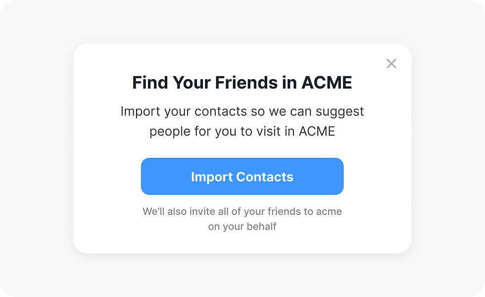
Friend spam is another invasive pattern in dark patterns in UI UX design. It pushes users to share contacts, invite friends, or connect social accounts in ways that feel unnecessary or manipulative.
For example, an app may ask for access to the contact list and make the permission screen sound like the only way to “find friends faster.” In reality, the app may be collecting data to send invitations or promotions to people the user never intended to contact.
This pattern can feel embarrassing and invasive because it turns a personal action into a broadcast. Better design gives users a clear reason for sharing contacts and lets them skip the step without pressure.
8. Hidden Subscription

Hidden subscription is a dark pattern in UI UX design where users do not clearly understand that they are enrolling in recurring billing. The signup flow may make the subscription look like a one time purchase, a free account, or a one time setup step.
For example, a fitness app may highlight “Start free today” and bury the fact that the plan automatically renews unless cancelled. The recurring nature of the purchase should be obvious, not buried in a terms section or a small note below the fold.
Good subscription design should clearly state the billing cycle, renewal date, cancellation method, and total price before checkout.
9. Sneak into Basket

Sneak into Basket is one of the most recognizable dark patterns in UI UX design. It happens when an extra item is quietly added to the cart without a clear decision from the user.
A shopping site may preselect an insurance add on, a donation, a warranty, or a premium shipping upgrade. The user only notices the extra charge after seeing the order summary. Sometimes the extra item is added through default checkboxes, which many users miss during checkout.
This pattern works by relying on haste and inattention. A better approach is to keep add ons optional, visible, and unselected by default.
10. Misdirection

Misdirection uses visual hierarchy to push attention toward one action and away from another. It is one of the most flexible dark patterns in UI UX design because it can appear through color, size, spacing, contrast, or placement.
For example, a page may make the “Accept” button huge and bright while the “Decline” option is tiny, low contrast, or hidden in a corner. Another common case is using a flashy card to make a premium plan feel like the obvious choice while the basic plan looks weak and unloved.
Not every strong visual hierarchy is unethical. The difference is intent. If the design is meant to guide users fairly, that is good UX. If it is meant to hide a choice, that is manipulation.
11. Price Comparison Prevention

Price comparison prevention is a dark pattern in UI UX design where the product makes it difficult to compare prices honestly. The goal is to stop the user from checking alternatives or understanding the true value of the offer.
One form is when a product bundles many features in a confusing way so the user cannot easily compare plan to plan. Another is when prices are shown without comparable unit pricing, such as hiding monthly cost inside an annual package. The user sees a polished offer but cannot quickly judge whether it is actually a good deal.
This pattern often works with the Goldilocks effect. By showing three options, the middle one can be made to look like the safest and smartest choice, even if it is not the best value.
Goldilocks effect in dark patterns in UI UX design

The Goldilocks effect is a pricing strategy where the middle option is made to feel just right. In dark patterns in UI UX design, the middle plan is often designed to look like the best balance of value and convenience, while the cheapest plan feels too limited and the expensive plan feels excessive.
For example, a subscription page may show Basic, Pro, and Premium. The Pro plan might be preselected, visually highlighted, and packed with the features users care about most. That alone is not always unethical. It becomes a dark pattern when the cheapest plan is intentionally crippled or the premium plan is exaggerated only to make the middle option appear irresistible.
The ethical version is simple. Let each plan speak for itself with honest feature differences and transparent pricing.
12. Privacy Zuckering

Privacy Zuckering refers to tricking users into sharing more personal data than they intended. In dark patterns in UI UX design, this can happen through vague permission prompts, confusing privacy settings, or misleading questions that seem harmless but actually collect sensitive information.
For example, a social app may ask for access to photos, contacts, and location using language that suggests the access is required for a basic feature. Or a profile setup page may use friendly wording to encourage users to reveal personal details they would not have shared if the purpose had been clear.
The best privacy design is direct. It explains why data is needed, what it will be used for, and gives users a real choice.
13. Trick Question

Trick Question is a simple but effective pattern in dark patterns in UI UX design. The interface asks something in a confusing, double negative, or misleading way so that users accidentally choose the wrong answer.
A classic example is a checkbox that says, “Uncheck this box if you do not want to receive updates.” Many users will miss the double negative and leave the box selected. Another example is a form that asks the user to opt out of marketing in a way that makes the safer choice harder to understand.
Clear writing matters just as much as visual design. The best solution is to use plain, direct language that anyone can read quickly without mental effort.
14. Urgency and Scarcity

Urgency and scarcity are often used in dark patterns in UI UX design to pressure users into acting quickly. Messages like “Only 2 seats left” or “Offer ends in 5 minutes” can be useful when they are real. They become manipulative when the numbers are fake, automated, or exaggerated.
A hotel booking site may show nonstop warnings that rooms are almost gone, even when availability is normal. A shopping app may show a countdown timer that resets every time the page is refreshed. These tactics create anxiety and reduce thoughtful decision making.
Real urgency is fine. Fake urgency is not. Honest design should only show scarcity when it is accurate and should never use fear as the main conversion tool.
How to design ethically instead of using dark patterns in UI UX design
The simplest way to avoid dark patterns in UI UX design is to be transparent, consistent, and respectful. Give users clear choices. Write button labels honestly. Show the full price early. Make cancellation as easy as signup. Use plain language. Keep consent separate from persuasion.
A good interface should help people decide, not trap them into regretting a choice later.
Final thoughts
Dark patterns in UI UX design may increase clicks in the short term, but they usually reduce trust over time. Great products are remembered for clarity, not confusion. When users feel informed and respected, they are more likely to return, recommend the product, and stay loyal.
If you are designing a product, use this article as a checklist. Whenever a flow feels too clever, too hidden, or too persuasive, pause and ask a simple question: is this helping the user, or is it helping the business at the user’s expense?


