Hick’s Law in UX Design


Imagine walking into a restaurant and being handed a menu with 500 dishes.
You are hungry. You know you want something good. But instead of making your life easier, the huge menu creates another problem.
What should you order?
Now imagine a different restaurant. The menu has 20 carefully selected dishes, divided into a few clear categories. You can scan it quickly, understand your options and make a decision without spending five minutes staring at the page.
The food may not be dramatically different.
The experience is.
This simple situation explains one of the most useful ideas in user experience design: Hick’s Law.
Whenever we design a website, mobile app, dashboard, ecommerce store or digital product, we are constantly asking users to make decisions.
Where should I click?
Which plan should I choose?
Where do I go next?
Which filter do I need?
Should I continue or go back?
The number and complexity of these choices can directly affect how quickly users make decisions. This is where Hick’s Law becomes incredibly useful.
And interestingly, Hick’s Law did not begin in a design studio, a product company or a Silicon Valley startup.
It began with experiments on human reaction time more than 70 years ago.
The Story Behind Hick’s Law
In 1952, British psychologist William Edmund Hick published a research paper titled On the Rate of Gain of Information in the Quarterly Journal of Experimental Psychology. His research investigated an interesting question.
What happens to the time required to respond when a person has more choices?
Hick conducted choice reaction experiments in which participants had to respond to different stimuli. As the number of possible choices increased, the time required to make a decision also increased.
But there was an interesting part.
The decision time did not increase in a simple one to one relationship with the number of options. Instead, it increased logarithmically.
A year later, American psychologist Ray Hyman conducted related research and explored the relationship between reaction time and the amount of information being processed.
Together, the work of Hick and Hyman became known as the Hick Hyman Law.
At the time, nobody was thinking about smartphone navigation, checkout buttons or onboarding screens.
They were studying human decision making. Yet decades later, their research became highly relevant to interaction design and human computer interaction. That is what makes Hick’s Law so fascinating.
A psychology experiment from the 1950s can help explain why a modern app feels effortless or frustrating.
What Is Hick’s Law?
In simple terms, Hick’s Law says:
The more choices a person has, the longer it generally takes to make a decision.
The relationship is logarithmic rather than linear.
The commonly used equation is: RT = a + b log₂(n + 1)
Here, RT represents reaction time, n represents the number of choices and a and b are constants determined through measurement.
You do not need to calculate this formula every time you design a screen.
The important idea is much simpler.
More choices create more decision making.
This does not mean that every interface should have only one button.
It also does not mean that a long list automatically creates a bad experience.
The real question is: How much decision making are you asking the user to do at one moment That distinction matters.
Hick’s Law in UX Design
In UX design, Hick’s Law helps designers understand the relationship between choice and decision time.
Consider a navigation menu. Version A and Version B

Both menus technically give users access to information.
But Version B asks the user to process far more possibilities before deciding where to go.
This is where Hick’s Law becomes useful.
Rather than thinking only about how much information can fit on a screen, UX designers can ask:
What is the minimum number of meaningful choices the user needs at this moment?
That question often leads to a better interface.
Why Too Many Choices Can Become a Problem
People often assume that giving users more options automatically makes a product more useful.
It sounds logical.
More options means more freedom.
But more freedom can also mean more decisions.
Imagine you are buying a subscription. You see three plans: Basic, Pro, Premium

You can quickly compare them.
Now imagine seeing twelve plans with slightly different storage limits, features and pricing.
The additional choices may not create additional value. They may simply make the decision harder. This is where good UX differs from simply adding features.
A strong interface does not show users everything at once. It shows them what matters when it matters.
Hick’s Law and Menu Design
Navigation is one of the easiest places to see Hick’s Law in action.
A website may contain hundreds of pages, but that does not mean the navigation needs hundreds of links.
Think about a university website.
There may be pages for admissions, courses, departments, faculty, events, research, scholarships, placements, careers, student services, policies and dozens of other things.
Putting every page directly into the main navigation would create an overwhelming interface.
Instead, the designer can group related content.

This creates a much smaller number of top level choices.
Users can then explore deeper when necessary.
This approach is often called progressive disclosure. The interface reveals additional choices when the user actually needs them.
That is a practical way of applying the thinking behind Hick’s Law.
Hick’s Law and Buttons
Buttons are another place where designers frequently create unnecessary decision making.
Imagine a confirmation screen after a user completes an important task.
You could provide five actions:
Save
Save and continue
Edit
DuplicateShare
Perhaps all five are useful. But are all five equally important at this exact moment?
Probably not.

A cleaner design might make the primary action visually dominant while moving secondary actions into a less prominent location.
The objective is not to hide functionality.
The objective is to establish priority.
Users should not have to stop and ask:
“Which of these five buttons am I supposed to press?”
Good visual hierarchy answers that question before they need to think about it.
Hick’s Law and Ecommerce
Online shopping provides some of the clearest examples of decision overload.
Imagine an ecommerce website selling running shoes.
A user arrives and sees 2,000 products.
Showing all of them at once is technically possible, but it forces the user to do a huge amount of filtering.
A better experience might begin with simple choices:
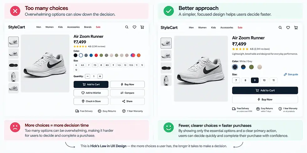
The product database may still contain thousands of products.
The difference is that the interface is helping the user narrow the decision progressively.
The system is doing more of the organizational work so the user does less cognitive work.
That is one of the most important lessons designers can take from Hick’s Law.
Hick’s Law and Mobile App Design
Mobile interfaces make this principle even more important because screen space is limited.
A mobile app cannot always show every available action.
That limitation can actually improve the experience.
Consider a banking application.
A user may commonly need to:
Check balance
Transfer money
Pay bills
View transactions
Manage cards
Deposit a cheque
Invest
Apply for a loan
Manage settings
If all of these actions receive equal visual weight on the home screen, the interface quickly becomes crowded.
A better design identifies the most important tasks and gives them priority.

Less frequent actions can move into secondary screens or menus.
The result is not simply a cleaner visual design.
It is a faster decision experience.
Does Hick’s Law Mean We Should Always Reduce Choices?
No.
This is one of the most common misunderstandings.
Hick’s Law does not say:
Fewer choices are always better.
Instead, it helps us understand that increasing choices can increase decision time.
Sometimes users genuinely need many choices.
Consider a professional software application such as a video editing tool.
A professional editor may need dozens of controls.
Removing them simply to make the interface look minimal would make the product worse.
The better approach is to organize the controls logically.
Frequently used tools can remain visible.
Advanced features can be grouped.
Rarely used settings can be placed deeper in the interface.
The goal is not minimalism for the sake of minimalism.
The goal is reducing unnecessary decision making.
The Difference Between Choice and Information
This is an important distinction.
A screen may contain a lot of information without necessarily creating a lot of choices.
For example, a dashboard could display sales numbers, revenue, conversion rates and graphs.
There may be plenty to look at, but the user may only have one main action.
On the other hand, a simple looking screen could contain five equally prominent buttons, creating a surprisingly difficult decision.
So when applying Hick’s Law, do not simply count everything on the screen. Look at the actual decisions the user has to make.
Ask:
How many meaningful alternatives are competing for the user’s attention?
That is much more useful than simply counting UI elements.
How UX Designers Can Apply Hick’s Law
The first step is to identify the decisions users make at each stage of a journey.
Do not begin by asking:
“How many elements should this screen have?”
Ask:
“What is the user trying to decide right now?”
Once you understand that, look at all the available options.
Are they genuinely necessary?
Can some be grouped?
Can secondary actions move elsewhere?
Can similar options be combined?
Can the interface guide the user toward the most common action?
Can advanced choices appear only after the user requests them?
These questions turn Hick’s Law from a psychology concept into a practical design tool.
Hick’s Law vs Minimalism
Hick’s Law and minimalist design are related, but they are not the same thing.
Minimalism is primarily about simplicity and restraint in visual and structural design.
Hick’s Law is about the relationship between choices and decision time.
A beautiful minimalist interface can still be difficult to use if it forces users to make unclear decisions. Likewise, a visually dense interface can still work well when its options are organized and prioritized intelligently.
This is why good UX is not simply about making screens look empty.
It is about making decisions easier.
When Hick’s Law Should Not Be Applied Too Aggressively
There are situations where reducing choices can actually hurt the user.
Imagine a professional designer using Figma.
They may need access to many tools because the nature of their work requires flexibility. Or consider an advanced analytics platform used by experienced data analysts.
Hiding everything behind multiple layers might make the interface slower, not faster. There is also an important difference between novice and expert users.
A new user may appreciate a simplified interface.
An experienced user may prefer direct access to advanced functionality.
Good UX therefore considers context, user goals and frequency of use.
Hick’s Law is a principle, not a rigid rule.
Hick’s Law and Cognitive Load
One reason Hick’s Law matters so much in UX is its connection with cognitive load.
Every decision requires some mental processing.
When interfaces present many competing options, users need to compare them, understand them and predict what will happen after making a choice.
That mental work can accumulate.
This is particularly important during tasks where users are already dealing with uncertainty.
For example, booking a flight can involve dates, airports, passengers, baggage, seats, fares and payment.
A thoughtful interface breaks the journey into understandable stages rather than presenting every possible decision simultaneously.
The user still makes all the necessary decisions.
The system simply distributes them across the journey.
The Real Lesson Behind Hick’s Law
The most valuable lesson is not “use fewer buttons.”
It is much more fundamental.
Do not make users solve problems that the interface can solve for them.
A user should not have to understand your internal information architecture.
They should not have to figure out which of ten buttons is the primary action.
They should not have to scan twenty categories when five meaningful groups would work.
They should not have to process advanced settings before completing a simple task.
Design is partly the art of deciding what the user needs to think about and what the interface can handle automatically.
That is where Hick’s Law becomes more than an academic theory.
It becomes a mindset.
Learn How to Apply UX Principles in Real Projects
Understanding UX laws is only the beginning.
The real skill comes from knowing when to apply them, when not to apply them and how they interact with other principles such as Fitts’s Law, Gestalt principles, visual hierarchy, cognitive load and information architecture.
At UI UX Academy students can build a stronger understanding of UX through practical design work rather than learning concepts in isolation.
Because ultimately, a UX designer is not simply someone who knows design principles.
A good UX designer knows how to turn those principles into decisions that make products easier, clearer and more enjoyable to use.
Final Thoughts
Hick’s Law teaches us something deceptively simple.
Every additional choice asks the user to think.
Sometimes that extra thought is necessary.
Sometimes it is created entirely by the design.
Great UX is about knowing the difference.
The next time you design a navigation menu, checkout page, onboarding flow or dashboard, pause before adding another button.
Ask yourself:
Does the user really need this choice right now?
That one question can lead to a surprisingly better interface.
And that is the real power of Hick’s Law.
Frequently Asked Questions
What is Hick’s Law in simple terms?
Hick’s Law states that the time required to make a decision generally increases as the number of available choices increases. The relationship is logarithmic rather than directly proportional.
Who created Hick’s Law?
The principle is named after British psychologist William Edmund Hick and American psychologist Ray Hyman. Hick published his influential research in 1952, followed by Hyman’s related research in 1953.
Why is Hick’s Law important in UX?
It helps designers understand how the number of choices can affect decision time and perceived complexity. Designers can use it when structuring navigation, menus, onboarding, forms, ecommerce filters and calls to action.
Does Hick’s Law mean fewer choices are always better?
No. The principle does not suggest removing useful functionality simply to make an interface look minimal. It encourages designers to manage choices thoughtfully based on user goals, context and task complexity.
What is an example of Hick’s Law in a website?
A navigation menu with five clear categories may be easier to scan and understand than a menu containing twenty individual links. Grouping related content can reduce the number of decisions users have to make at once.
Is Hick’s Law still relevant today?
Yes. Research reviews continue to discuss Hick’s Law in relation to choice reaction time, cognitive processing and human computer interaction. It remains a commonly referenced principle in interface and interaction design.


